Unbounded: Wealth Concentration
The Current Situation
Wealth concentration is the highest it has ever been, and rising. The super-rich are out competing you for the real resources that shape your opportunities. They also buy influence over the people who write the rules.
But how does that concentration look across the entire population? Let’s visualize the wealth of every individual.
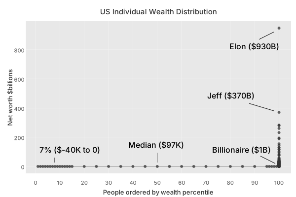
You probably have not seen a chart like this before. Two things make it strange. First, the concentration is so extreme that the “curve” is a right angled corner. Second, the picture is stitched together from several datasets.2
These charts are normalized to individuals rather than households. For household wealth, generally you can multiply the cutoffs by 2, except for billionaires (where wealth is typically not split with a spouse equally).
Net worths under $1B are visually indistinguishable. For the sake of trying to see the curve, let’s exclude billionaires. Doing so zooms in by 1000x.
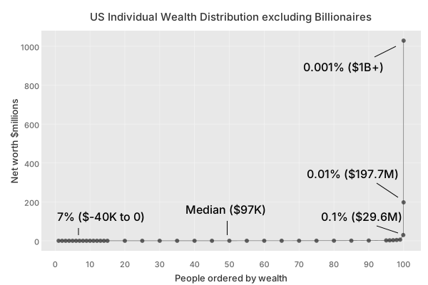
At this scale the distribution is still a right angle. So now let’s exclude everyone in the top 0.1% (over $29.6M). Doing so zooms in by another 30x, 30000x in total.
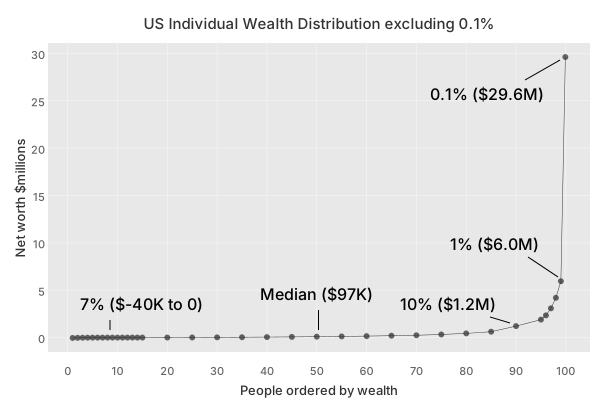
It is telling that we can only now begin to “see” the distribution curve. Even then, we are still mostly looking at the top 10% of it. Let’s zoom in again by excluding the top 1% (over $6.0M). Doing so zooms in by another 5x, zoom is now at 150000x in total.
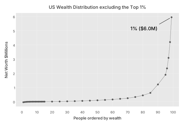
Even at this ultra zoomed in scale the wealth curve is steep. To see what is happening at the bottom and middle, we need to zoom in even further by excluding the top 10% (over $1.2M). Zoom is now at 1000000x.
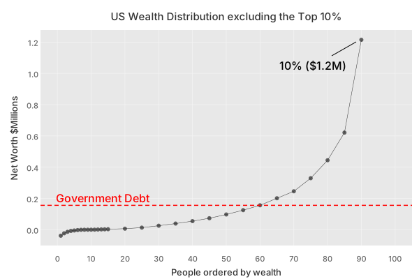
Now we can see more clearly that 7% of adults in the US have a negative net worth. What is worse is that when we look at government wealth, the treasury balance sheet is at net negative 41.7T, which equates to 156K per adult individual. In a very real sense we do carry this government debt. 20% of the tax you pay goes directly to the interest on this debt as explored in Who Pays Tax?. Through this lens, 60% of adult individuals have negative net worth.
It’s truely dizzying to try to imagine 1000000x zoom. The wealth curve spans several orders of magnitude, making its scale difficult to grasp. A video visualization by politizane, Wealth Inequality in America, gives more time to the gravity of the sense of the scale.
Now we will look at the full range on a log scale. This compresses the steepness so the whole distribution fits on one chart. We did not begin with this view because log scales are easy to misread, and they can create a false sense of familiarity.
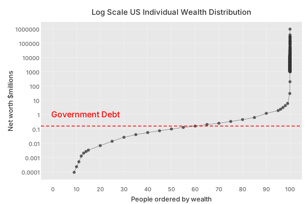
Negative net worths cannot be shown on a log scale. Even so, the chart makes it clear that this is not a fair competitive market distribution. The bottom half is in an extremely weak position.
What does the very top of the wealth curve look like?
There are almost a thousand billionaires in the US.
| billionaire-count | total-wealth |
|---|---|
| 982 | $9.3T |
Has it always been like this? No.
To get a feel for how wealth concentration has been changing, here is a plot of the wealth share growth by cohort.
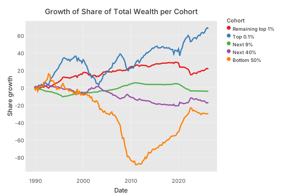
The Federal Reserve series starts in 1989 and shows that over the past 37 years, the top 0.1% of wealth holders have increased their share of total US wealth by roughly 68%.
However, due to the inherent difficulty of capturing peak fortunes via traditional survey data, alternative methodologies suggest this figure is heavily understated. Utilizing administrative IRS data via the tax capitalization method, economists Saez and Zucman estimate that the top 0.1%’s relative wealth share growth is actually closer to 100% to 200% over the same period.5
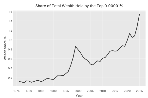
While the top 0.1% has experienced immense gains, the concentration at the apex 0.00001% (representing roughly the 20 to 35 wealthiest individuals) has grown even more exponentially. According to analysis by Gabriel Zucman, this elite tier saw their share of total U.S. household wealth skyrocket, growing their share by 15x over the last 45 years, as shown in Figure 1.
When wealth accumulates in a few hands, the rest of society competes for a smaller pool of resources. That makes housing, capital, and opportunity more expensive for everyone else. Wealth starts acting like a black hole, pulling in property, equity, and political influence.
“Where wealth accumulates, men decay.” – Oliver Goldsmith
Capital gets pushed toward holding existing assets rather than solving new problems. The economy becomes more about preserving position than creating new value. That is the static trap. Assets and resources grow slowly as a total pool while concentrated capital compounds rapidly. The economy then asks most people to compete for whatever is left over.
Over history, the share of total wealth held by the Top is increasing.
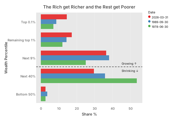
The ability to compound wealth is unevenly distributed.
The economy is influenced by geography, technology, infrastructure, culture, and global events. Government policy still has outsized influence over how the gains are distributed. Tax policy, regulation, and public spending all affect growth, stability, and living standards. Tax policy matters most here because it determines whether capital is rewarded for circulating or for hiding.
Extreme wealth concentration changes how the economy behaves. It shrinks access to land, housing, infrastructure, and other fixed resources. It also lets passive wealth compound faster than most wages can grow. That makes the economy feel static for everyone outside the top. Only a very small slice at the top is capturing the strongest gains. Most people experience the system as tighter, more expensive, and less forgiving. Affordability, mobility, and living standards all sit downstream of that shape. Wealth distribution is the root thing.
The United States is under dangerous stress. The evidence is clear: political instability has worsened, trust in institutions is low, and the government struggles to function. We have all the resources we need, yet we are heading deeper into avoidable crises.
In a healthy society, people should be able to move up by effort and contribution. When asset ownership becomes too concentrated, that opportunity is reduced. There is no plausible path to build assets and move up the ladder. The system stops rewarding broad participation and only rewards possession. Today entry into the top 1% already requires asset ownership rather than salary alone. Inheritance and equity ownership matter more than work.
When I was a kid, I spent countless afternoons playing Tiapan, a trading game set in Southeast Asia. I sailed between ports, bought cargo, dodged pirates, and tried to make a fortune. It didn’t take long to discover the best strategy. Smuggle opium. I bought it by the shipload. I transported it across the map. I sold tonnes and tonnes of it. I bought cannons to protect my ship, and defeated the navies of entire countries. I had no idea what opium was. When my brother explained that it was a highly addictive drug, I was horrified. I was just trying to win the game. The game rewards snowballing advantages, and I didn’t understand the consequences.
These days I find myself wondering what our own economic game rewards. When I first looked into wealth distribution, the main charts I found showed how much wealth each group owned over time. I remember thinking, “What’s the big deal?” Most discussions about wealth concentration revolve around percentages and statistics. I find that hard to connect with.
It wasn’t until I started plotting growth shares that something clicked. I realized what was actually happening. Every system rewards something. Our game rewards snowballing wealth. And the winners are pulling away.
Conclusion
Wealth concentration is the outcome of compounding asset ownership. Wealth is the most concentrated it has ever been, and continues to concentrate. Extreme inequality is dangerous, with negative social and economic effects. History offers severe warnings about the consequences.
In the next part, Economic Growth, we think harder about how inequality impacts growth.
Footnotes
Top 0.00001% wealth share from Realtime Inequality.↩︎
The chart combines lower and middle percentile wealth data from CUNY, top-end percentiles from Realtime Inequality, and individual billionaires from Forbes.↩︎
Forbes’ annual real-time billionaire list provides the source for the U.S. billionaire count and the top-end wealth values used in the chart.↩︎
The Federal Reserve’s Distributional Financial Accounts provide the cohort-level wealth-share series.↩︎
Tax-capitalization studies by Saez and Zucman estimate that top-end wealth shares grew even faster than survey-based measures suggest over the same period.↩︎